

Role
Target Audience
Duration
Tools
Responsibilities
My Role
Service: Junior UX Designer
Company: Fly
Industry: E-Commerce
Overview:FLY is an e-commerce startup focused on events and fashion. It develops two mobile apps:
- Customer App: Helps users discover events, purchase tickets, and find outfits tailored to specific events.
- Business App: Enables brands and event organizers to list and sell products, increasing visibility and sales for emerging designers.
Context & Purpose:Initially a six-month placement, my role expanded as I took on leadership in usability testing and cross-team collaboration. I joined after initial MVP was completed. In these early stages, my role was refining wireframes, improving prototypes, and ensuring consistent branding across both apps.
Devices

Challenge
Challenge:
What’s the problem?
Water sports enthusiasts face significant challenges with existing tools. The overwhelming complexity of deciphering weather forecasting data, combined with a lack of integrated trip planning tools in water sports apps, leads to planning fatigue, scattered information, and safety risks. Many users are forced to piece together information from various apps and websites, making the process stressful and time-consuming.The challenge is clear: How can we simplify complex weather data, streamline trip planning, and reduce decision fatigue to create a stress-free, enjoyable experience for water sports enthusiasts?
Design Brief:
To deliver beautifully displayed, easy-to-understand wind, wave, and weather forecasts—combined with integrated trip-planning tools.
Research
Research Analysis
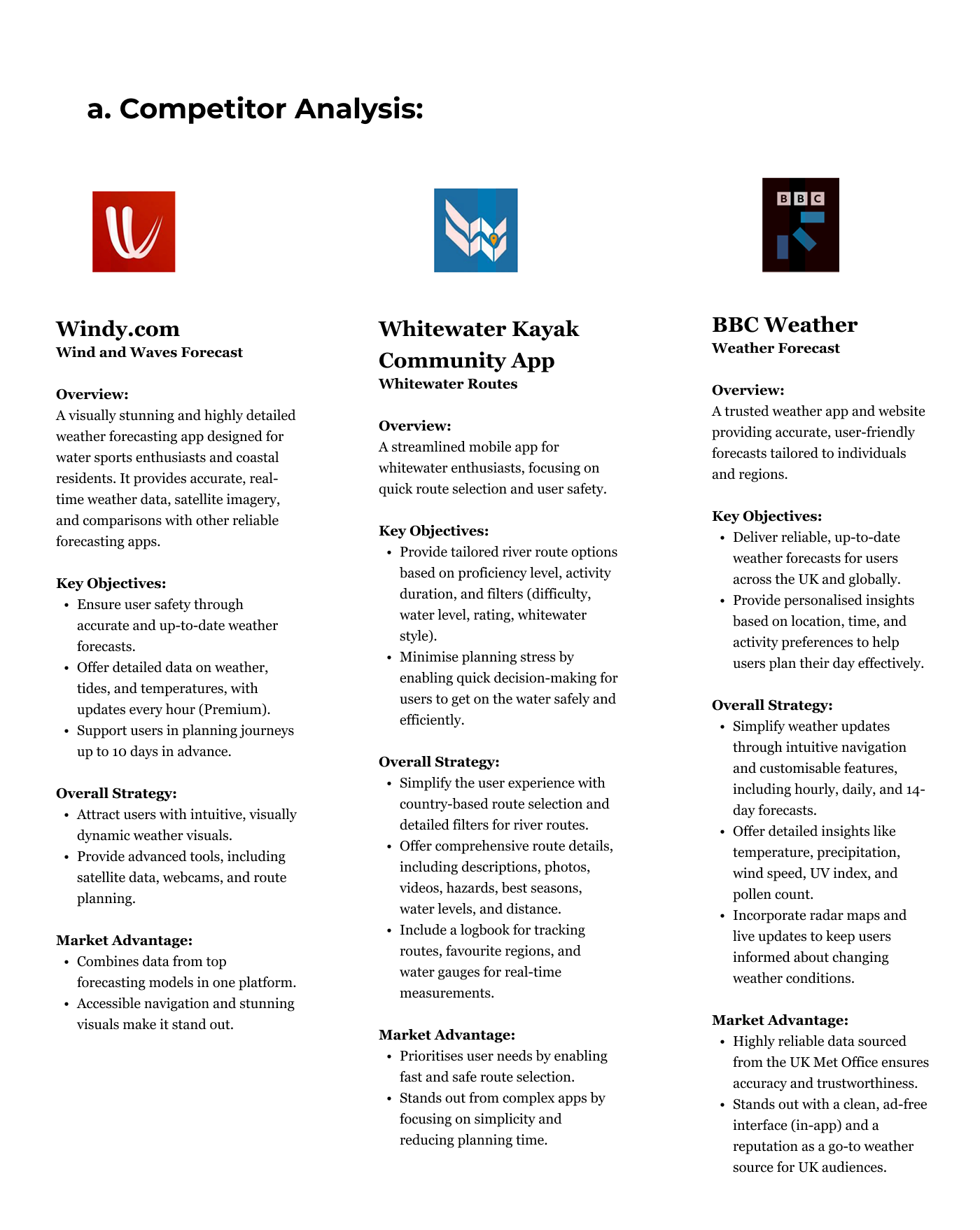
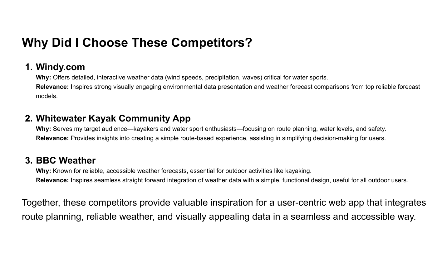
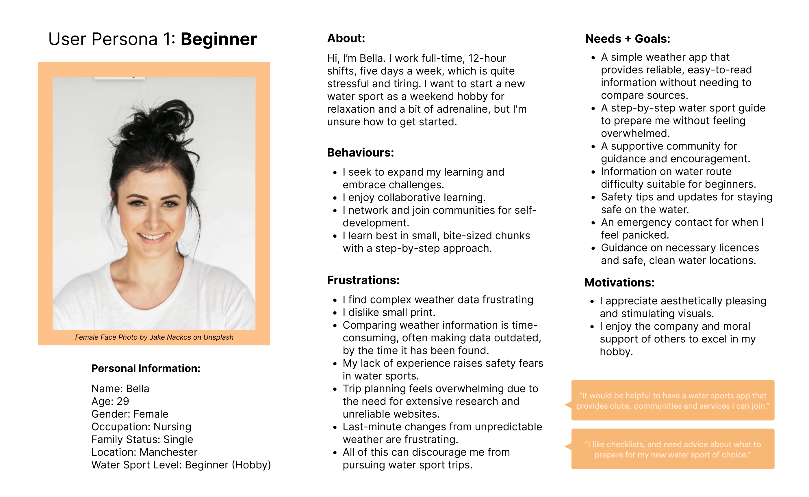
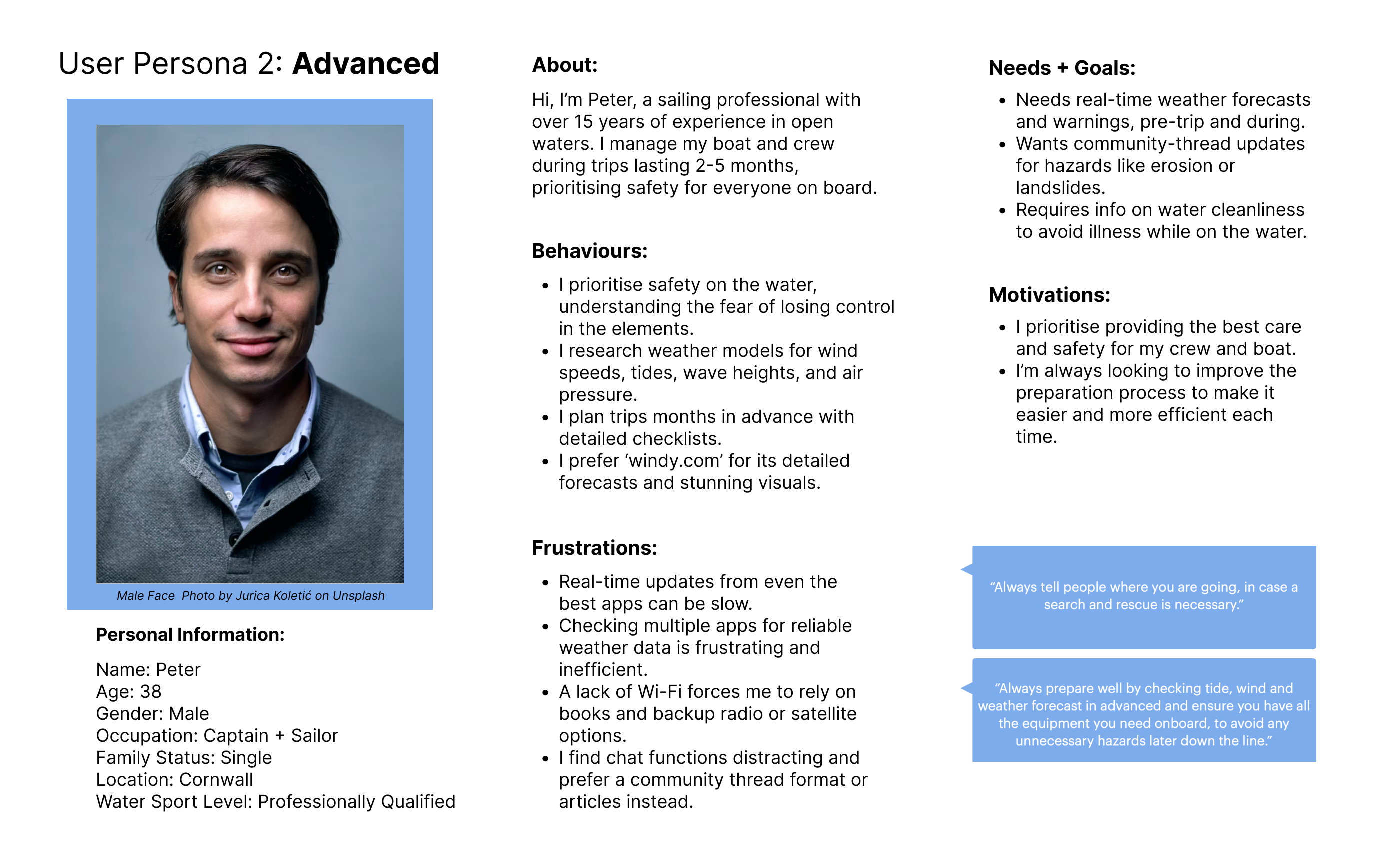
To gain a deeper understanding of the problem, I conducted extensive research into weather conditions, water safety, and user habits. I performed a Competitor Analysis to identify market gaps and carried out User Research to uncover key user needs and pain points; interviewing water sports enthusiasts across all skill levels (beginner to advanced).
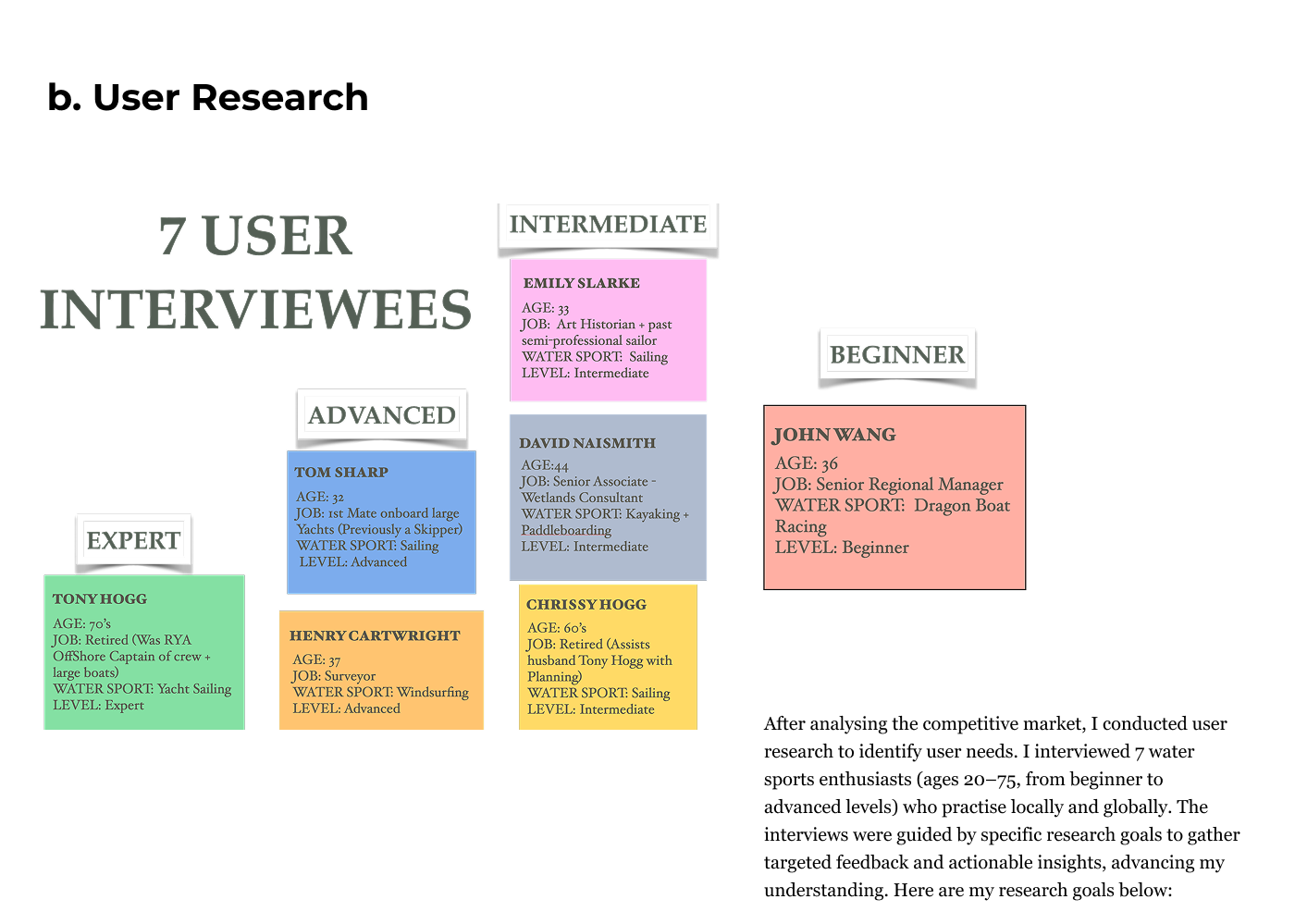
User Research Results
I analysed user research using affinity mapping to identify behaviours, pain points, and goals. I then created pie charts to visualise the percentages of these elements, providing deeper insights into user needs and pain points.
User Research
User Research Goals:
1. Water Sport Preparations: Understand the step-by-step process users go through when preparing for water sports to identify ways to eliminate stress and decision overload. This will help ensure the app addresses these challenges effectively.
2. Safety on the Water: Investigate the hazards and challenges users face while on the water and gather expert advice on how to stay safe. This will inform the safety features and tips the app should provide.
3. App Display: Identify user preferences and friction points related to app display and navigation. This insight will guide the app’s design, ensuring a smooth and intuitive user experience.
4. User Needs for a Water Sport + Weather Forecasting App: Explore what users expect from a water sport and weather forecasting app, and understand why they would choose this app over other options in the market.
5. Community: Determine whether a community feature would be useful and valuable for water sports enthusiasts, and how it could enhance the app experience.
Define
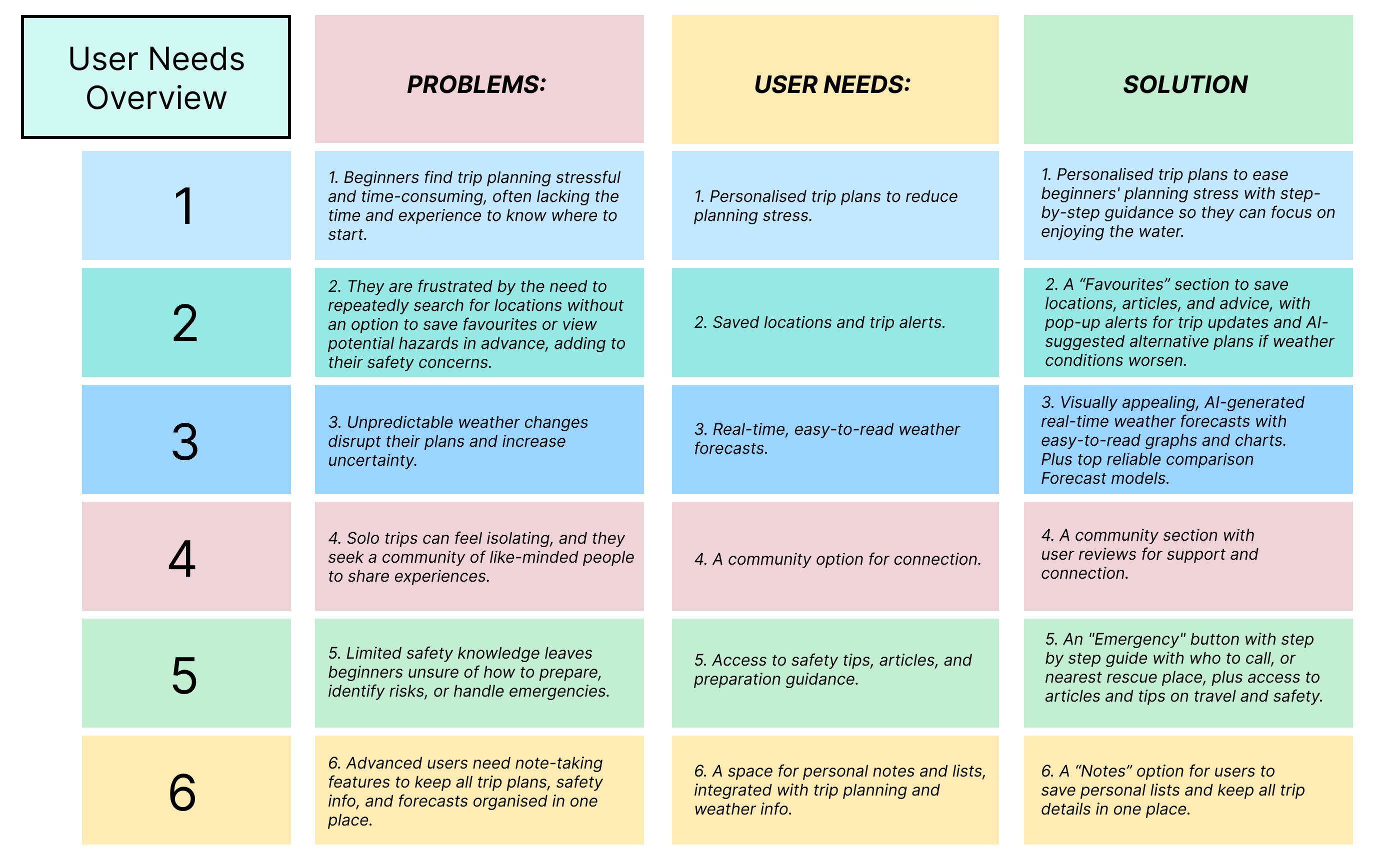
How do I define Research
I defined the research by synthesising insights into actionable strategies, focusing on key Problems, User Needs, and potential Solutions. I created detailed user personas from interview findings, highlighting challenges, goals, and motivations. I then mapped user journeys to ensure the app would meet user needs at every stage.
Ideate
How did I generate ideas?
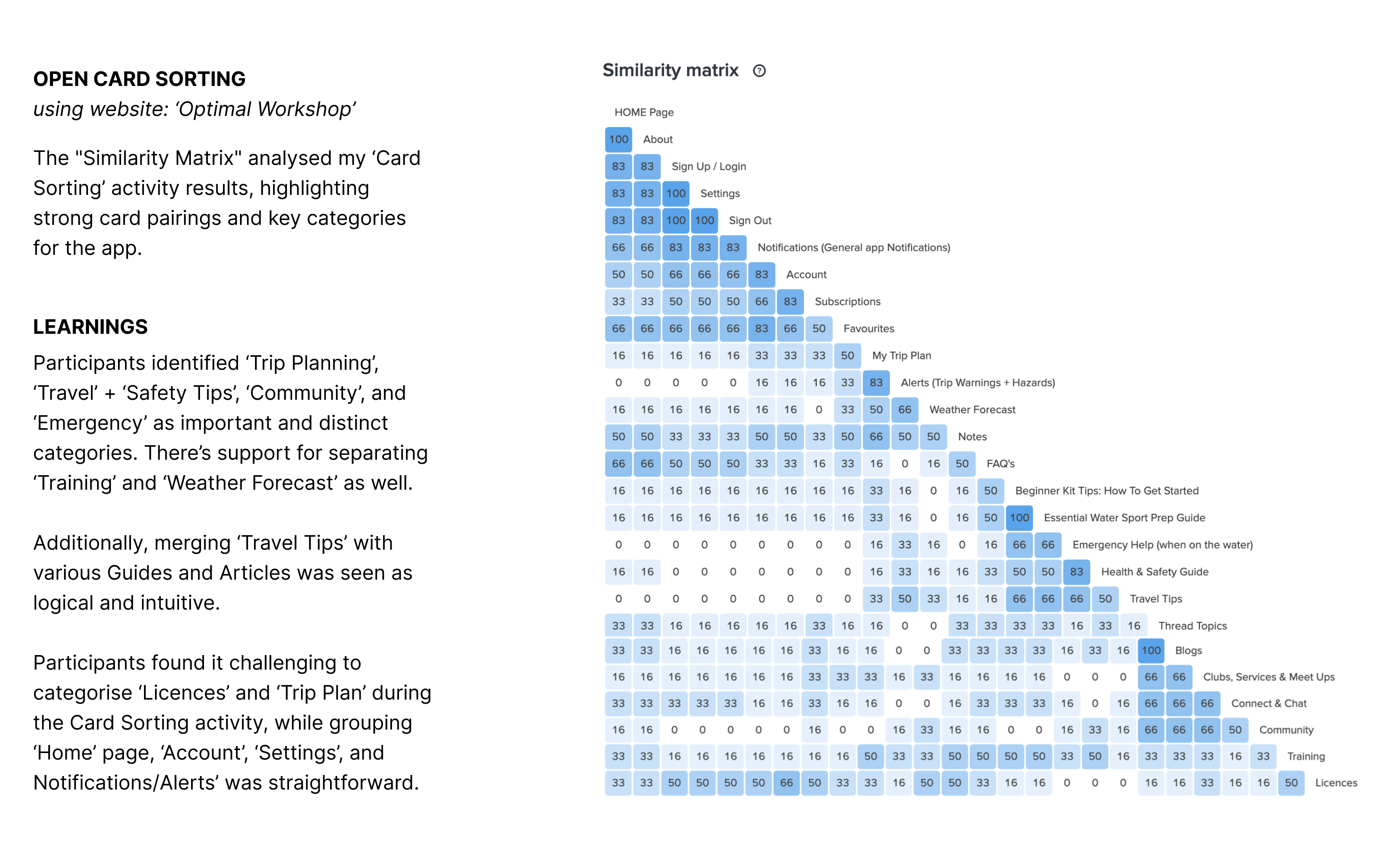
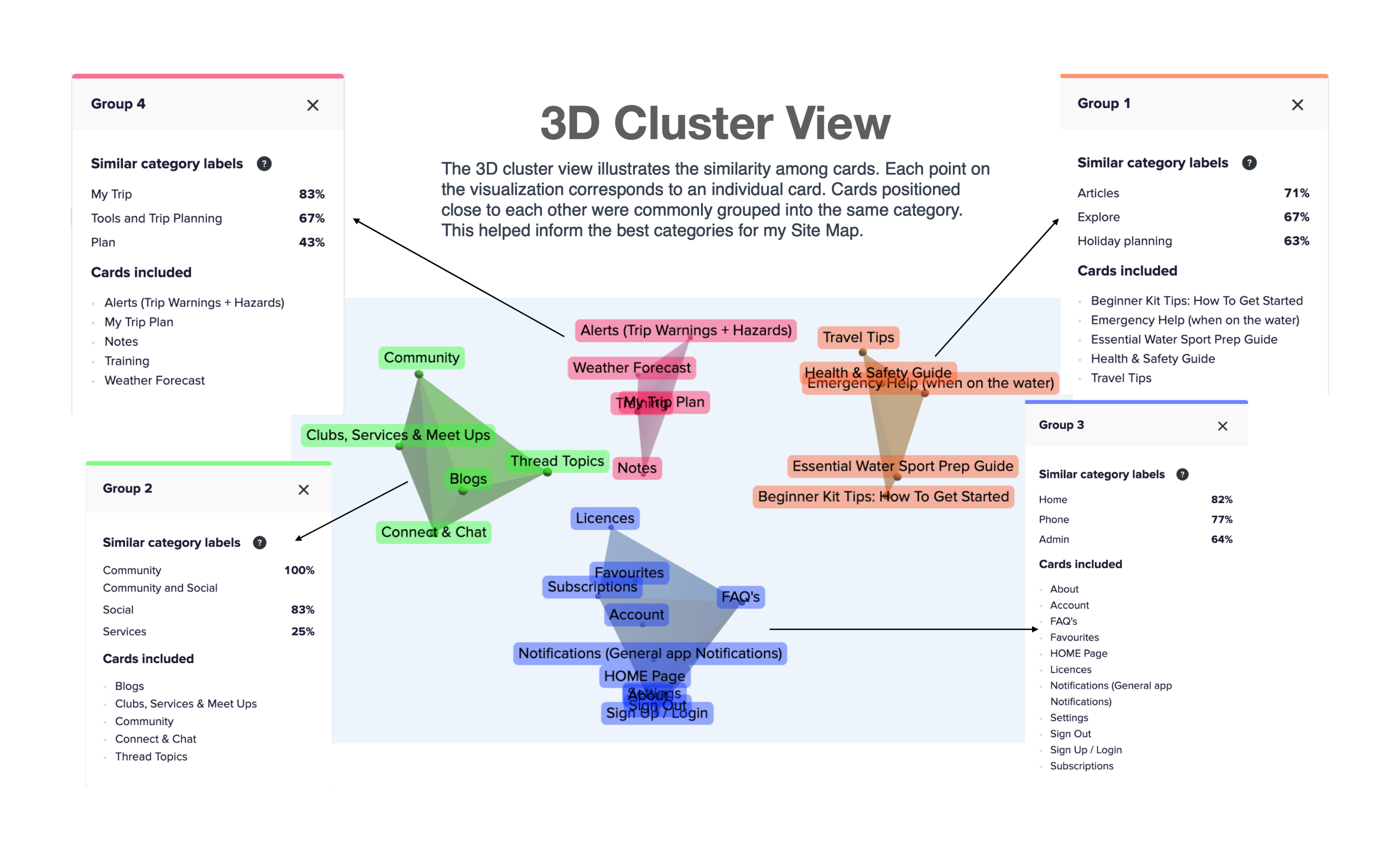
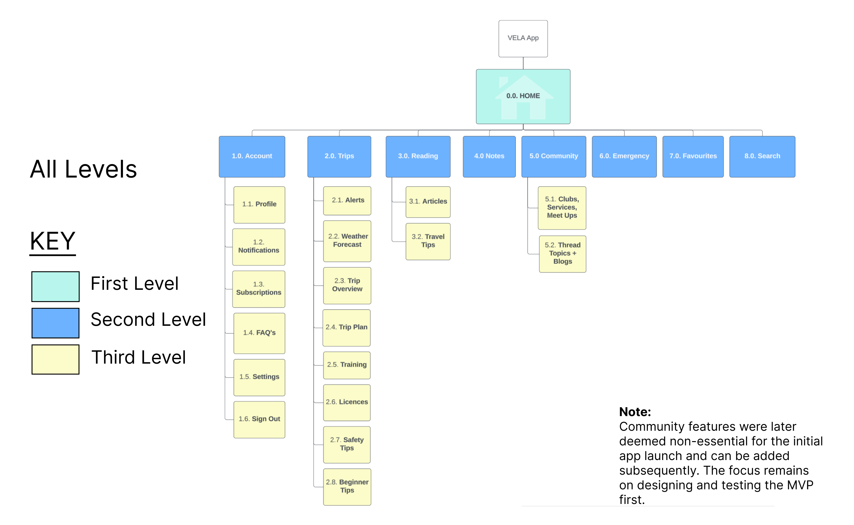
With a solid foundation, I moved on to brainstorming and mapping out solutions. This included designing user flows to simplify navigation and ensure intuitive app interactions.To refine the app’s structure, I created a preliminary Sitemap and tested it using Card Sorting. Feedback from participants helped me adjust the sitemap to better align with user expectations and goals.
TASK ANALYSIS:
Entry Point:
Open app and select “Water Sport”
Success Criteria: Trip Report received, accessible, and downloadable for offline use.
1. Open app
2. Select “Water Sport”
3. Apply filters as needed
4. Tap “Generate Report”
5. View personalised trip report with preparation steps and contacts
6. Download report for offline use OR create an account for added features like weather alerts and alternative trip options if conditions change.
Objective:
1. As a busy nurse and beginner in water sports, I want an app with quick, step-by-step preparation instructions, an equipment guide tailored to my needs, and contact details for rentals and accommodations, so that I am fully prepared and have essential info at hand.
2. Also, I want to connect with a community of water sports enthusiasts, so that I can enjoy moral support and shared experiences.
Design
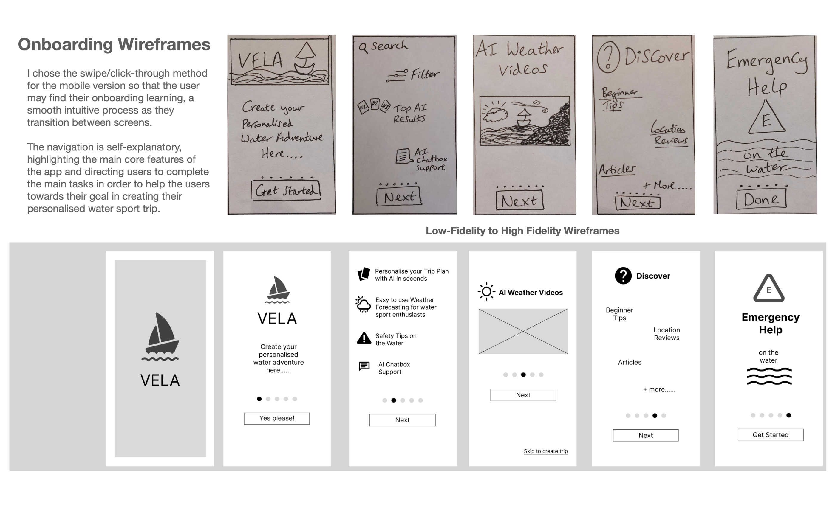
Wireframing & Prototyping:
With the sitemap finalised, I began creating wireframes, starting with rough sketches on paper and progressing through low- and mid-fidelity prototypes, prioritising usability and visual clarity. Here is a taster of the onboarding wireframes and navigation using pen, paper and Figma software, plus some of my style guide.
Design Outcome
Final Design & Outcomes Summary
The final designs offer a seamless, intuitive experience that integrates event discovery, clothing purchases, and ticketing for customers, while providing businesses with a more efficient product management and sales process.
Key Features:
Customer App:
- Home Screen: Displays featured events and outfit suggestions.
- Search Screen: Allows users to explore events and clothing.
- Product Listings: Lists outfit options based on event selection.
- Payment Screen: Secure ticket and clothing purchase options.
Business App:
- Dashboard: Overview of sales performance.
- Inventory Management: Easy product listing and tracking.
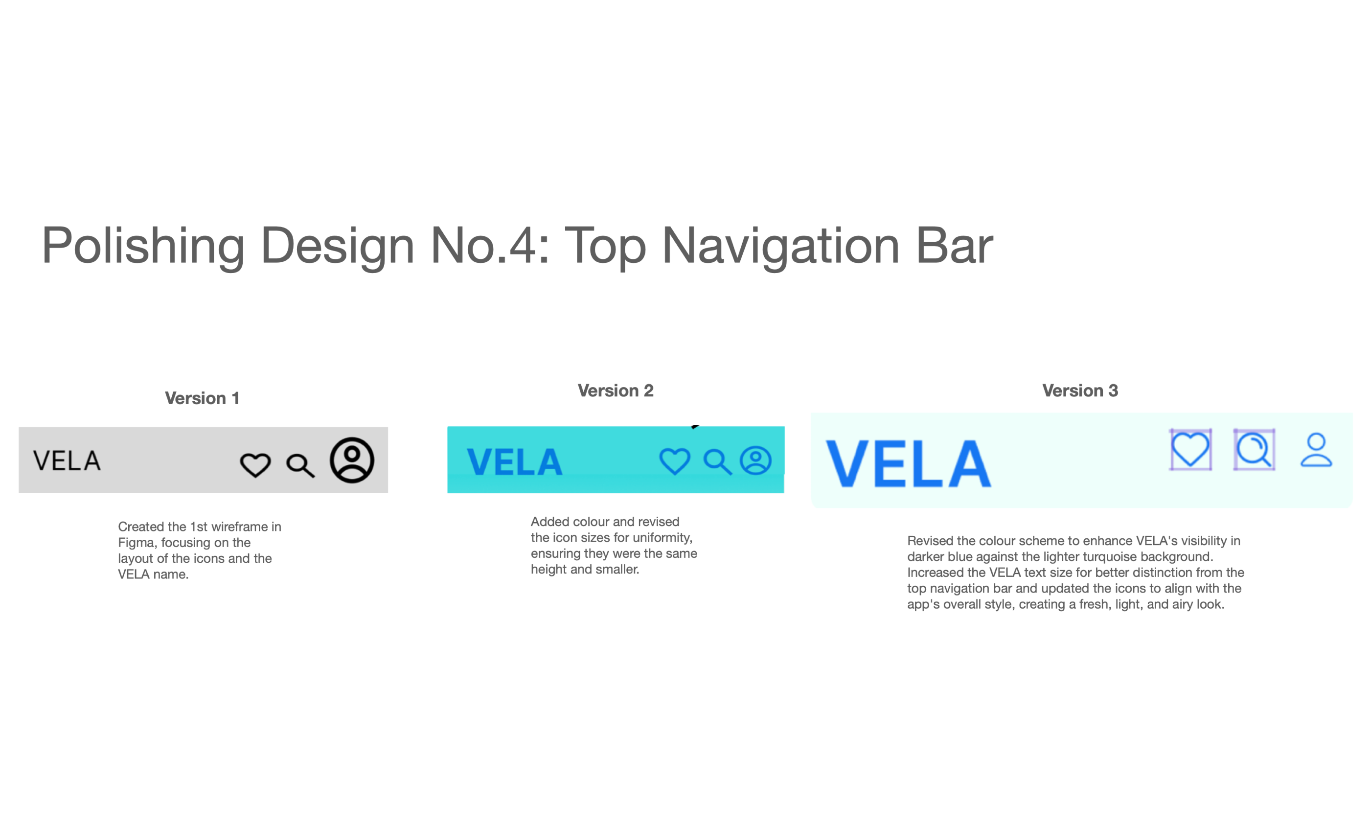
Polish the Design
Iterative Polishing
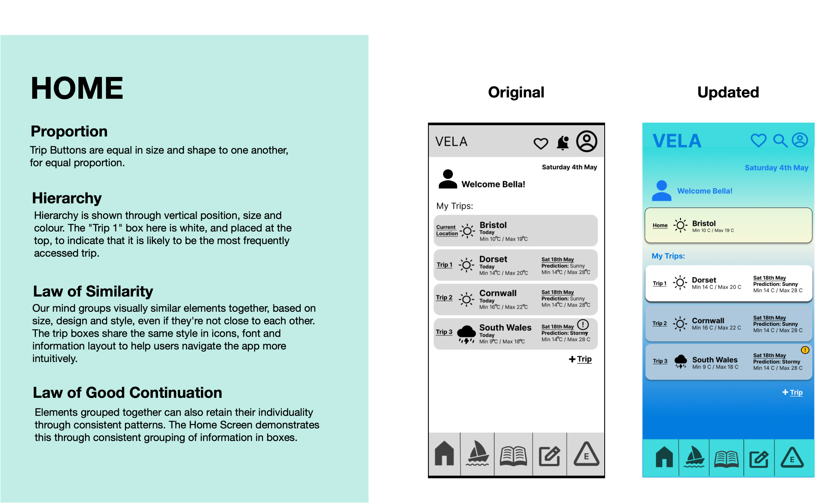
Through iterative testing and feedback, I refined the designs, applying Gestalt principles for clear visual hierarchy and improved functionality. Peer reviews led to additional adjustments, such as:
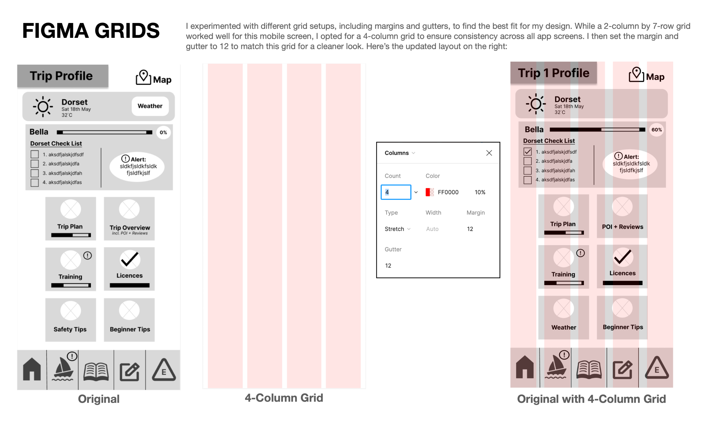
- Aligning layouts with Figma grids for consistency.
- Improving colour contrast for better readability.
These refinements ensured a polished and cohesive design that prioritised user-centred experiences.
Iterative Design Reflections
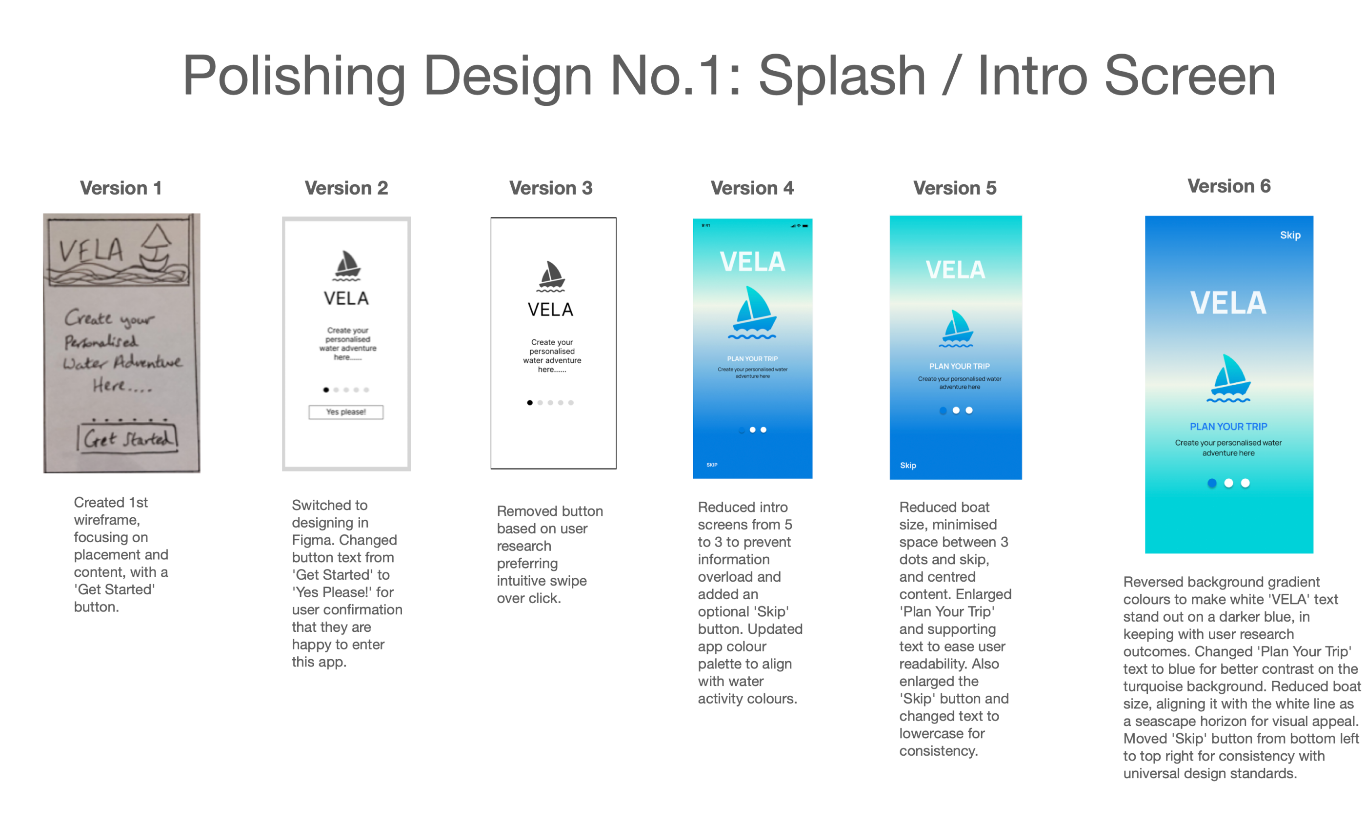
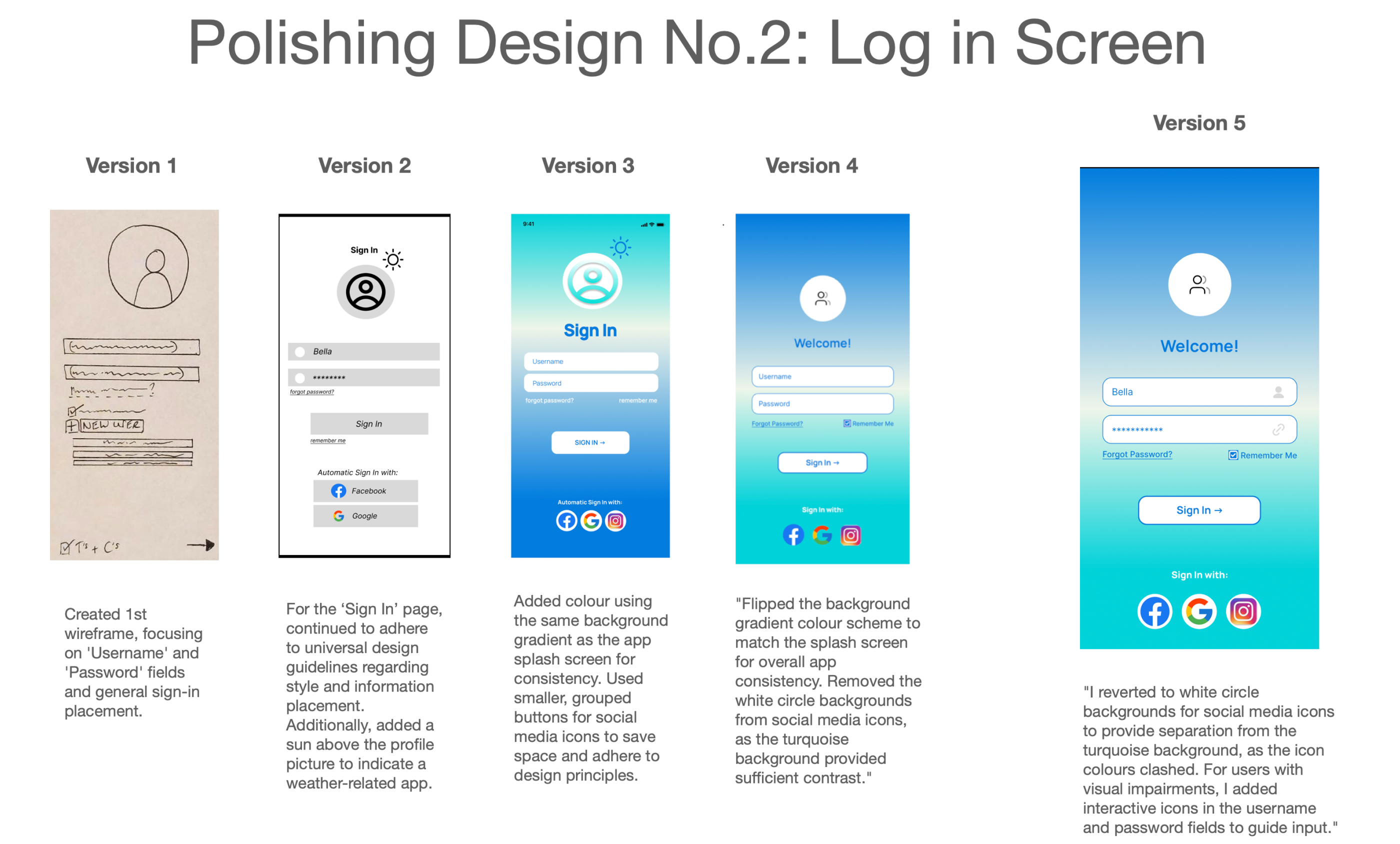
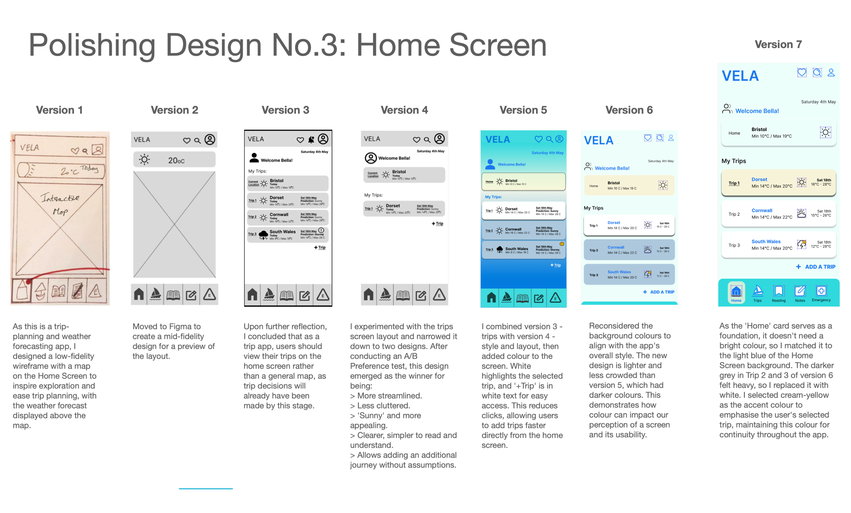
The design process evolved from low-fidelity hand-drawn wireframes to high-fidelity versions, with refinements made at each stage based on user research. Key changes made to the app include:
- Intro Screens: Simplifying the number of screens to avoid overwhelming users.
- Color Palette: Adjusting the palette to align with water activity themes.
- Interactions: Replacing buttons with intuitive swipe interactions based on user preferences.
- Buttons and Icons: Refining the placement and size of these elements for better usability.
- Space Management: Introducing a 'More' button to reveal additional content without cluttering the interface.
- Consistency: Using a uniform color scheme and icon sizes for a cleaner, cohesive interface.
Future Iterations: High Level Plan
The primary focus is on "Keep it Simple" and "Less is more," treating the app as a Minimum Viable Product (MVP) to establish a solid foundation before adding features.
User Testing Evolution
To polish the application, the designer plans to implement:
- Regular Testing: Conducting shorter, frequent testing cycles similar to Instagram.
- A/B Preference Testing: Using validated user feedback to enable continuous design enhancements.
- Focused Testing: Concentrating on key components like navigation, accessibility, and new functionalities.
Validation Methods
Hypotheses will be validated through:
- Usability Testing (Interviews)
- A/B Preference Testing
- Qualitative + Quantitative Data (Competitive Analysis)
- Frequent Testing
Timeline for Implementation
The designer plans to spend the next two months testing features, followed by four to six months refining the design to improve functionality, usability, and performance.
Would you like me to summarize these points into a bulleted list for a presentation?
Phase 7
Outcome
Iterative testing and peer reviews informed final refinements:
- Simplified intro screens and refined colour palette.
- Adjusted icon and button placement for clarity.
- Ensured consistent typography, spacing, and visual hierarchy.
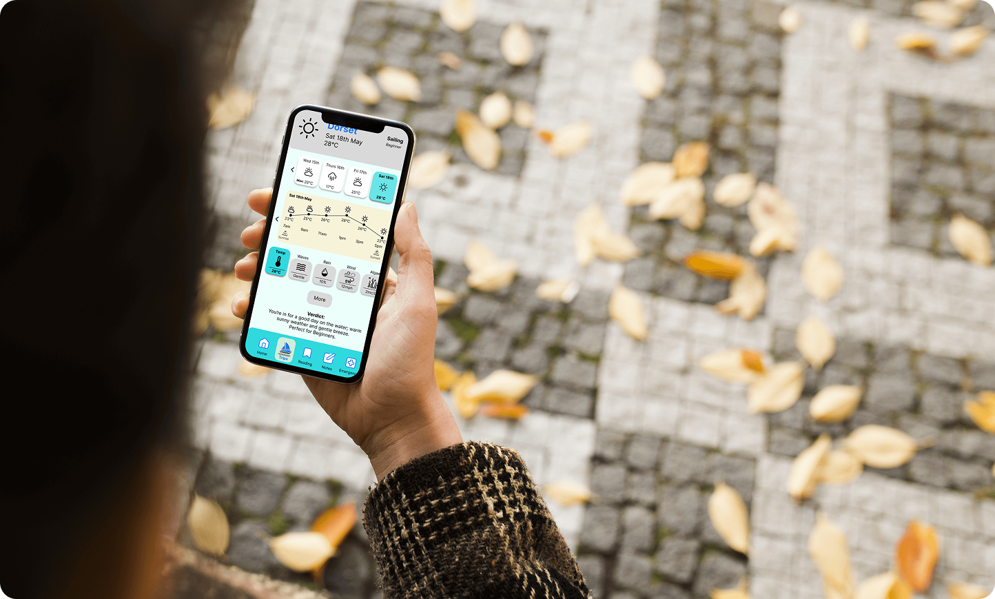
Final high-fidelity screens included splash, login, home, navigation bars, trip planning, and weather pages. The result was a functional, intuitive, and visually cohesive app meeting user needs.
Reflections & Key Learnings
Challenges & Solutions
Some design ideas faced technical or time constraints. Through collaboration and regular feedback loops, I adapted solutions while preserving usability principles.
Key Learnings:
- Understanding user needs through research and testing, and validating decisions with measurable results to ensure solutions match real-world behaviours.
- Balancing ownership and collaboration, taking initiative while contributing effectively within a team.
- Continuous learning and adaptability to grow as a designer and improve outcomes.
- Clear communication across roles accelerates decision-making and keeps projects aligned.
Employers
Key Takeaways for Employers
Reflecting on the process, I identified key takeaways for future projects:
- Practical experience across UX research, design, prototyping, and usability testing.
- Ability to translate user insights into actionable improvements, ensuring functional, intuitive, and accessible designs.
- Experience working with diverse user bases, reinforcing the importance of usability, inclusivity, and accessibility.
- Commitment to continuous learning, adaptability, and contributing to projects that have a real-world impact at scale.
- Mindset rooted in ownership, collaboration, and user-centred thinking.