
Role
Target Audience
Duration
Tools
Responsibility
My Role
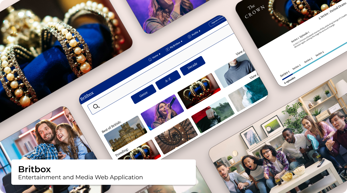
I worked as a UI Designer (with UX responsibilities) on an independent redesign of BritBox International, a global streaming service for British TV and film. My focus was creating a cohesive, modern, and intuitive experience across desktop, tablet, and mobile. I applied a mobile-first approach, refining visual design, improving navigation, and establishing a consistent brand identity throughout the platform.
Devices

Overview
Phase 1: Understanding the Problem
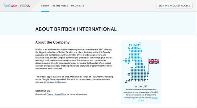
BritBox's outdated UI caused friction for users who wanted an intuitive, engaging experience. Navigation, search, and content discoverability were inconsistent, and the platform lacked a clear visual hierarchy. My objective was to create a polished interface that reinforced BritBox's British identity, improved usability, and encouraged engagement across devices.
Research
Phase 2: Research & Analysis
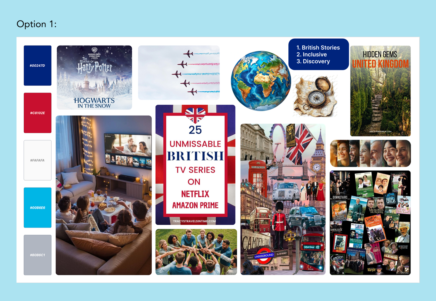
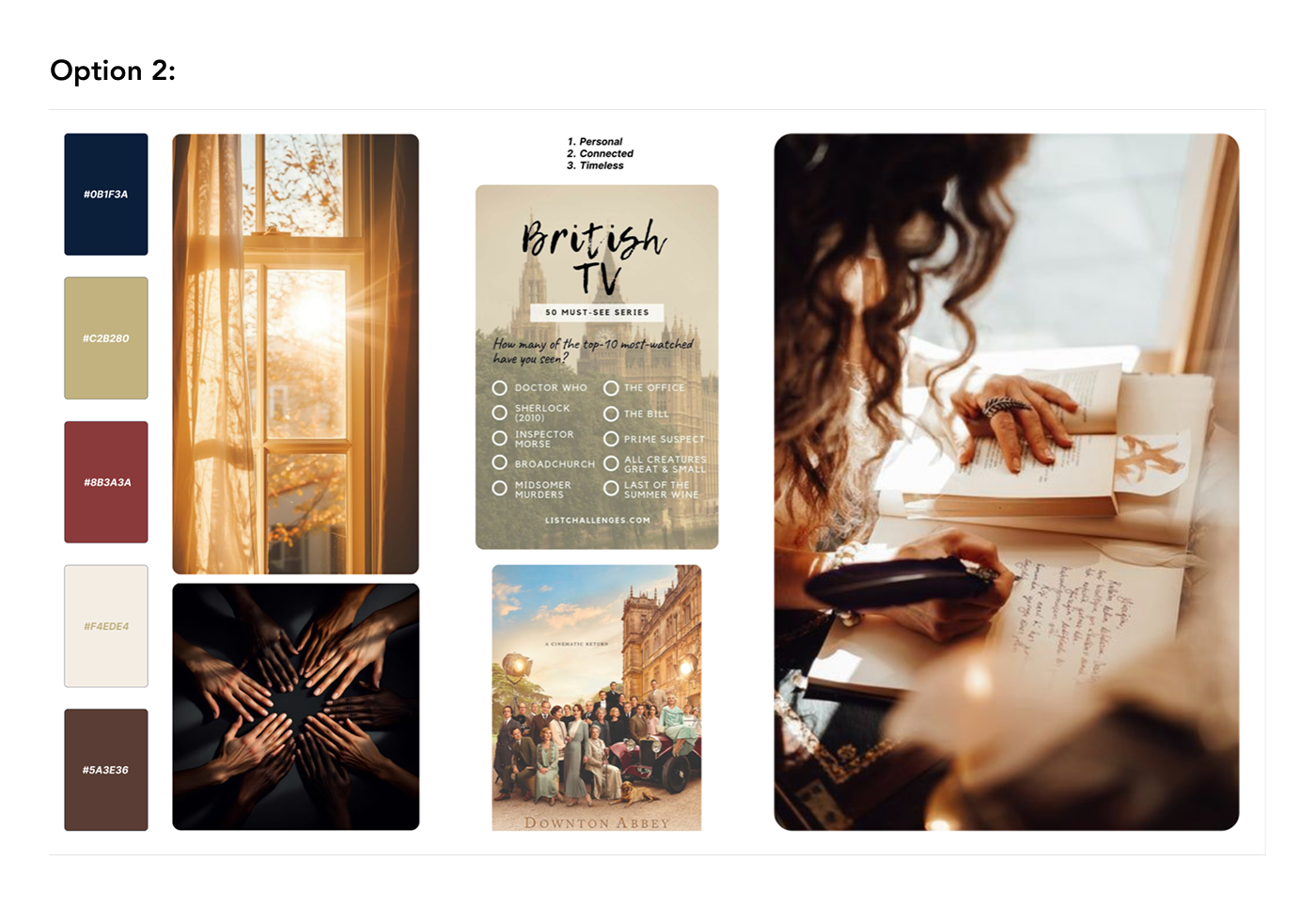
I conducted user interviews and gathered insights on discoverability, navigation, and satisfaction. I explored competitor services and identified opportunities to improve content search, browsing, and engagement. Moodboards helped define three guiding themes: British Stories, Inclusive, and Discovery. I also examined UI patterns, typography, spacing, and iconography to inform a consistent design system.
User Interview Results
The need for:
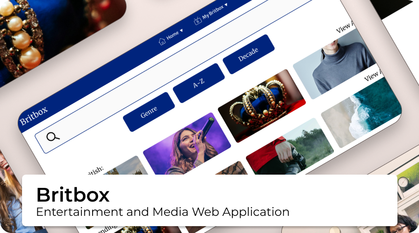
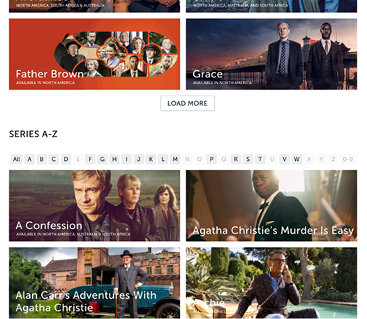
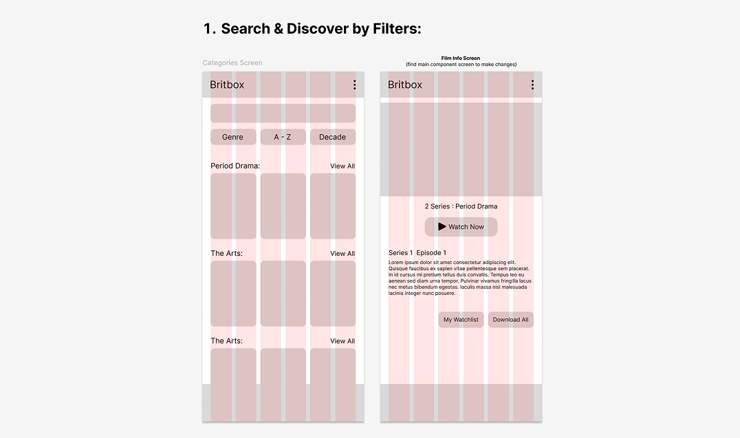
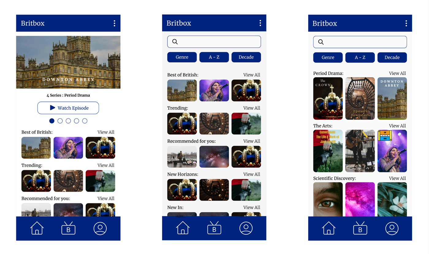
- Improved Search: including search by decade, genre, and A–Z.
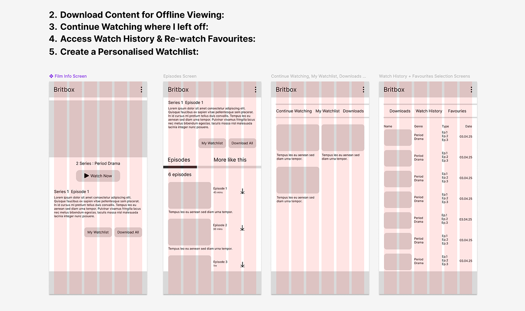
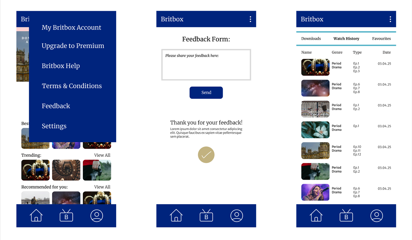
- Offline Viewing: for travel and commuting - (Download option)
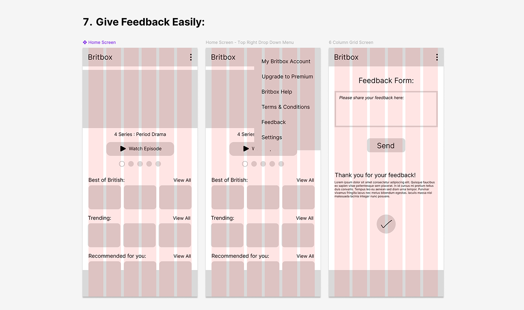
- User Feedback Integration: quick ways for users to provide suggestions.
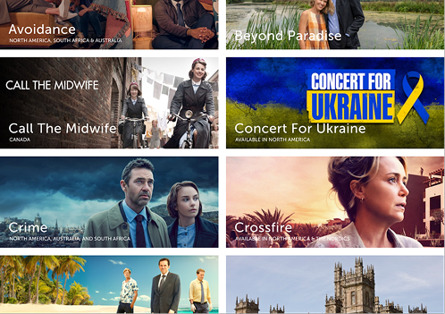
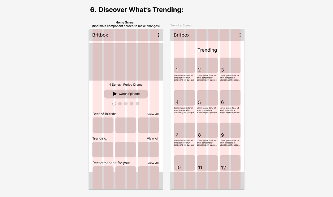
- Film Organisation Categories: 'Continue Watching', 'Trending', 'Watchlist', 'Archive by Decade'.
Moodboards:
I chose Mood Board 1 over Mood Board 2 because it best captures the platform's identity and the experience I aim to communicate. Its keywords — British Stories, Inclusive, and Discovery — alongside a colour palette rooted in British tradition yet refreshed with modern tones, convey both heritage and contemporary relevance. While Mood Board 2 emphasised timelessness and personal connection, Mood Board 1 offers a broader perspective that celebrates discovery and cultural exchange. This helps BritBox feel bold, inclusive, and appealing to new international audiences, while still honouring its British roots.
Phase 3
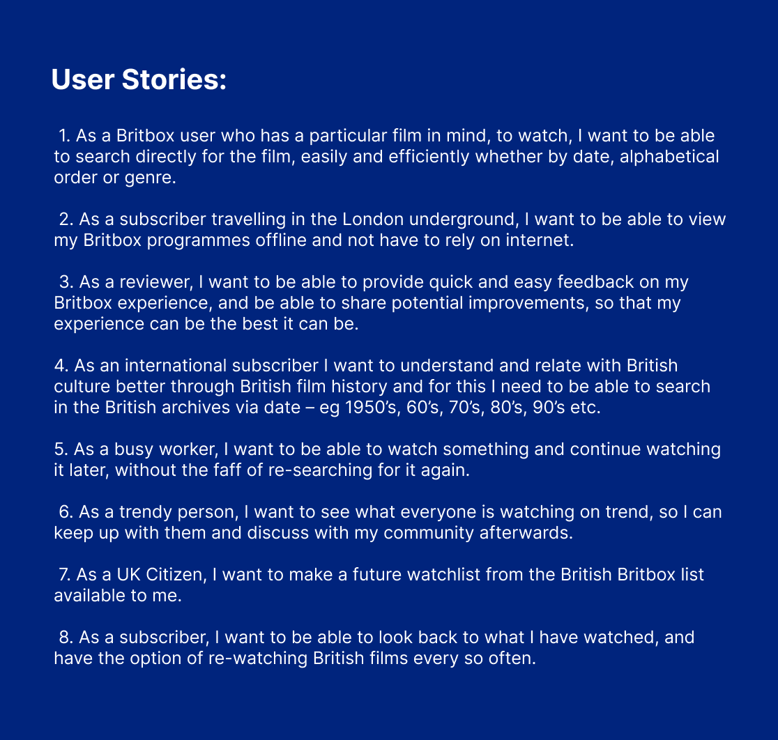
I created user stories to capture key user needs, including discovering content, offline viewing, continuing shows, and providing feedback. These stories guided design decisions across desktop, tablet, and mobile, ensuring that interactions were intuitive, accessible, and aligned with the platform’s brand personality.
Design Process
Phase 4: The Evolution of Wireframing, Designing & Decisions
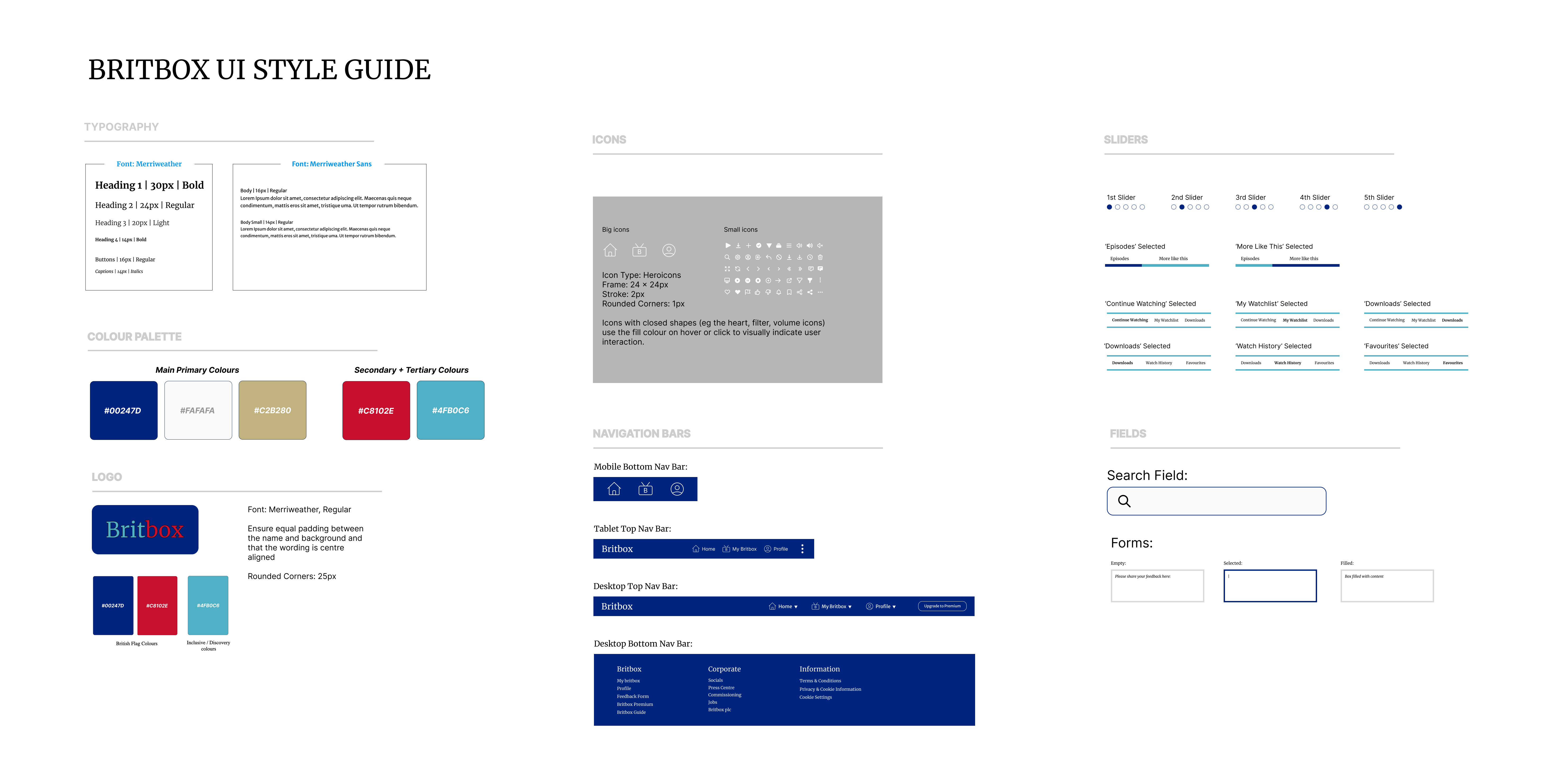
I created low- and mid-fidelity wireframes based on my user stories, starting with mobile-first layouts and iterating on grids, spacing, and readability. I refined line spacing, typography, and hierarchy to express the brand's personality. My typography choices — Merriweather for headings and Merriweather Sans for body text — balanced tradition, inclusivity, and discoverability.
Navigation was informed by user stories and established UI design patterns. The colour palette reflected British heritage while remaining modern and accessible. I experimented with icons and imagery before selecting Heroicons for their clarity and versatility. The wireframes then evolved into high-fidelity, responsive designs for desktop, tablet, and mobile.
I then designed mobile-first mobile low-mid fidelity wireframes based upon the user stories:
Design Process - continued
Navigation
User Story: As a subscriber travelling in the London underground, I want to be able to view my Britbox programmes offline and not have to rely on internet.
Why: Enables usage in low-signal areas; increases accessbility and satisfaction.
UI Pattern Used: Settings, Hierarchy, Contrast, Alignment (option to download for offline viewing)
.png)
Branding / Style guide
Icons
I considered several icon libraries for the BritBox app, including Lucide Icons, Feather Icons, Material Icons, and Font Awesome. I ultimately chose Heroicons because their style strikes a good balance between classic and modern, complementing the overall aesthetic and font choices for the app. Their icons are clear, consistent, and visually versatile, with both outline and solid options to create hierarchy and focus where needed.
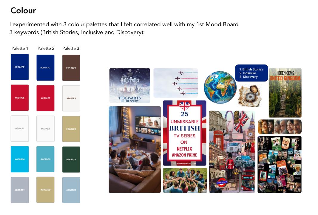
Colour
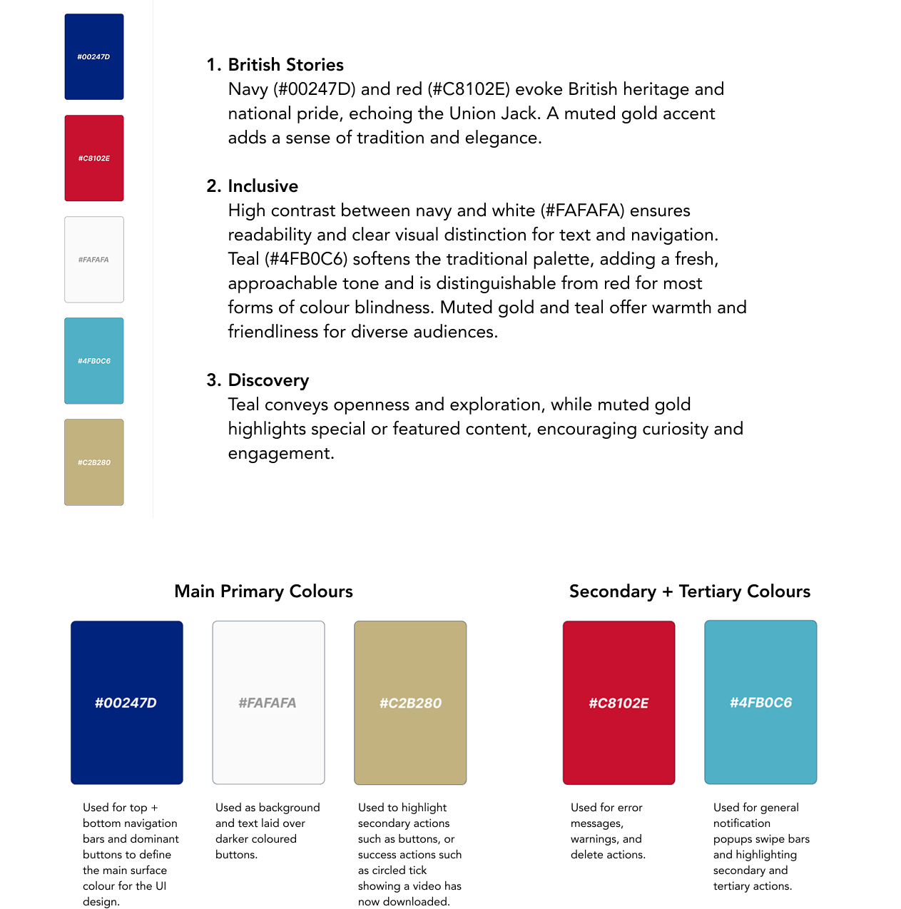
I selected palette 2 because it strikes the strongest balance between my 3 moodboard themes - British Stories, Inclusive, and Discovery - while also meeting accessibility considerations. The deep navy (#00247D) and bold red (#C8102E) create an immediate connection to British heritage, echoing the Union Jack and evoking a sense of cultural pride. The crisp white (#FAFAFA) ensures clarity and high contrast for legibility. The teal tone (#4FB0C6), repeated for emphasis, softens the traditional palette and adds a modern, approachable twist.
This makes the design more inclusive by creating a friendly and calming visual presence, accessible to a broad audience including those with colour vision deficiencies. It also supports the idea of Discovery, as teal has connotations of openness, freshness, and new horizons. By combining cultural recognition with warmth and modernity, palette 2 successfully communicate the emotional story of my app - celebrating British narratives while welcoming and engaging all users.
Colour
I selected palette 2 because it strikes the strongest balance between my 3 moodboard themes - British Stories, Inclusive, and Discovery - while also meeting accessibility considerations. The deep navy (#00247D) and bold red (#C8102E) create an immediate connection to British heritage, echoing the Union Jack and evoking a sense of cultural pride. The crisp white (#FAFAFA) ensures clarity and high contrast for legibility. The teal tone (#4FB0C6), repeated for emphasis, softens the traditional palette and adds a modern, approachable twist.
This makes the design more inclusive by creating a friendly and calming visual presence, accessible to a broad audience including those with colour vision deficiencies. It also supports the idea of Discovery, as teal has connotations of openness, freshness, and new horizons. By combining cultural recognition with warmth and modernity, palette 2 successfully communicate the emotional story of my app - celebrating British narratives while welcoming and engaging all users.
Colour Usage Overview
To bring BritBox’s interface to life, I structured the colour palette to guide hierarchy, usability, and visual clarity. I began by defining the primary colours, which form the foundation of the brand’s identity — shaping navigation bars, main surfaces, and key actions. These colours give users an immediate sense of the platform’s character while keeping the interface clear and intuitive.
Next, I identified secondary and tertiary colours to support less prominent elements, from notifications and status indicators to error messages and warning actions. These colours provide subtle guidance, drawing attention when needed without overwhelming the user, and help maintain a consistent, approachable experience across the platform.
Images
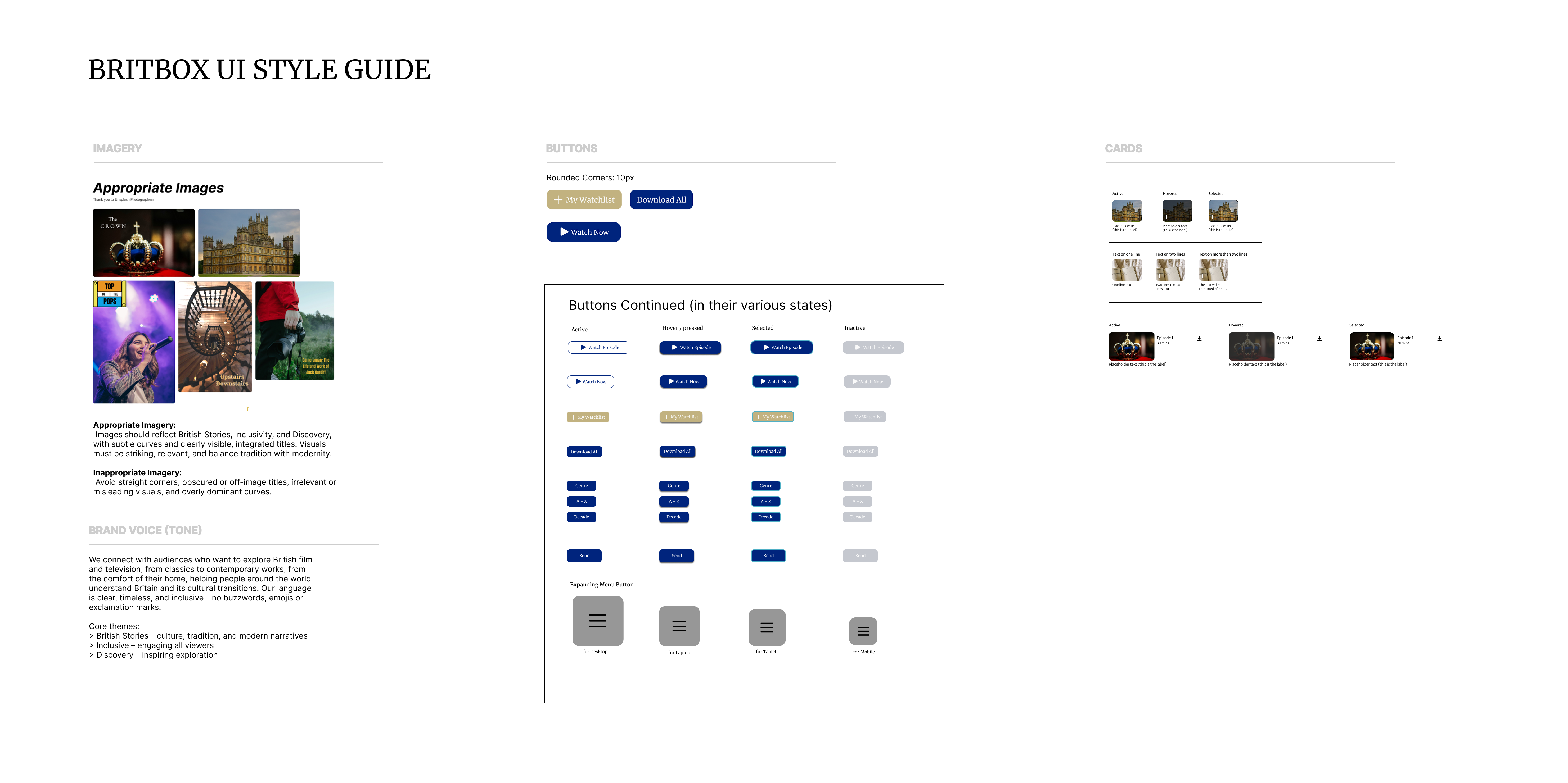
Appropriate Imagery: Images should reflect British Stories, Inclusivity, and Discovery, with subtle curves and clearly visible, integrated titles. Visuals must be striking, relevant, and balance tradition with modernity.
Inappropriate Imagery: Avoid straight corners, obscured or off-image titles, irrelevant or misleading visuals, and overly dominant curves.
Prototyping
Phase 5: UI Execution & Prototyping
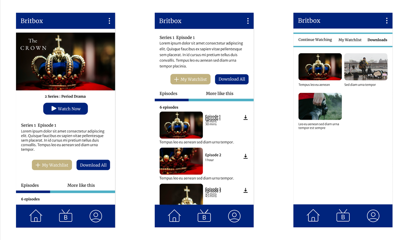
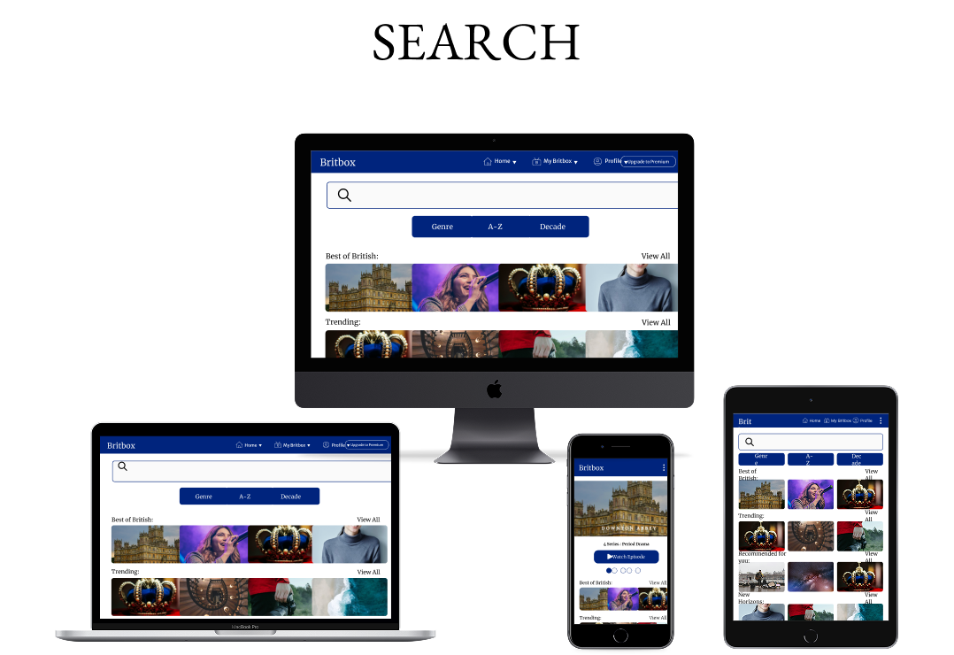
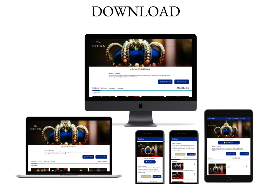
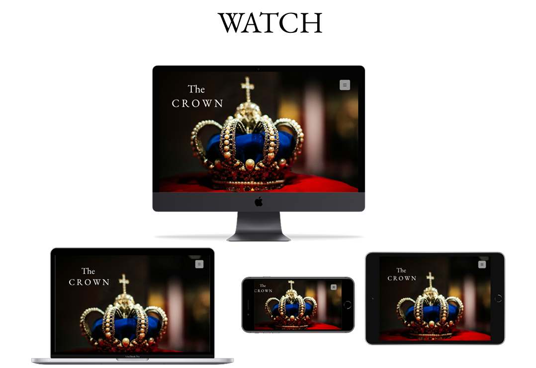
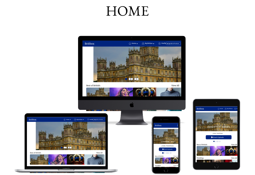
I developed the high-fidelity UI, ensuring a cohesive design system across devices. Components included navigation, search, watchlist, continue watching, and offline download functionality. Responsive grids and breakpoints were applied for all device types (mobile, tablet, and desktop). Style guides covering typography, colour, iconography, and imagery were created to guide future development.
Mobile:
Outcomes
Reflections
Reflections & Key Learnings:
Working on BritBox strengthened my understanding of designing across multiple devices and balancing brand identity with usability. I learned the importance of:
- Experimentation: Comparing multiple options for typography, colours, and icons ensures alignment with brand identity.
- Harmony: Typography, imagery, icons, and colour must share a consistent design language for a cohesive experience.
- Streaming UX: Designing for content discovery and interaction across devices provided practical experience relevant to platforms like Sky, BBC and ITV.
Looking Ahead:
If extended, the project would benefit from:
- A/B and usability testing with real users to validate design choices and refine micro-interactions.
- Ensuring inclusivity across diverse audiences while maintaining the balance of classic and modern British design.
Key Takeaways for Employers
Phase 10
- Hands-on experience redesigning a global streaming platform with responsive layouts across desktop, tablet, and mobile.
- Practical skills in UI/UX design, visual hierarchy, brand identity, and design systems that enhance consistency and engagement.
- Experience designing streaming-specific features such as Continue Watching, Watchlist, and offline viewing.
- Strong ability to understand user needs in online streaming, TV, and media sectors and translate insights into actionable design decisions.
- Proven capacity to deliver visually appealing, intuitive, and user-centred experiences while balancing brand identity, usability, and business goals.